Description
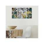
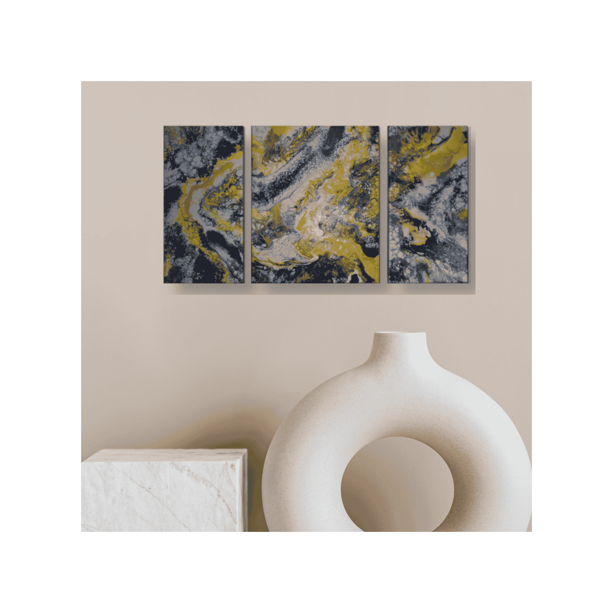
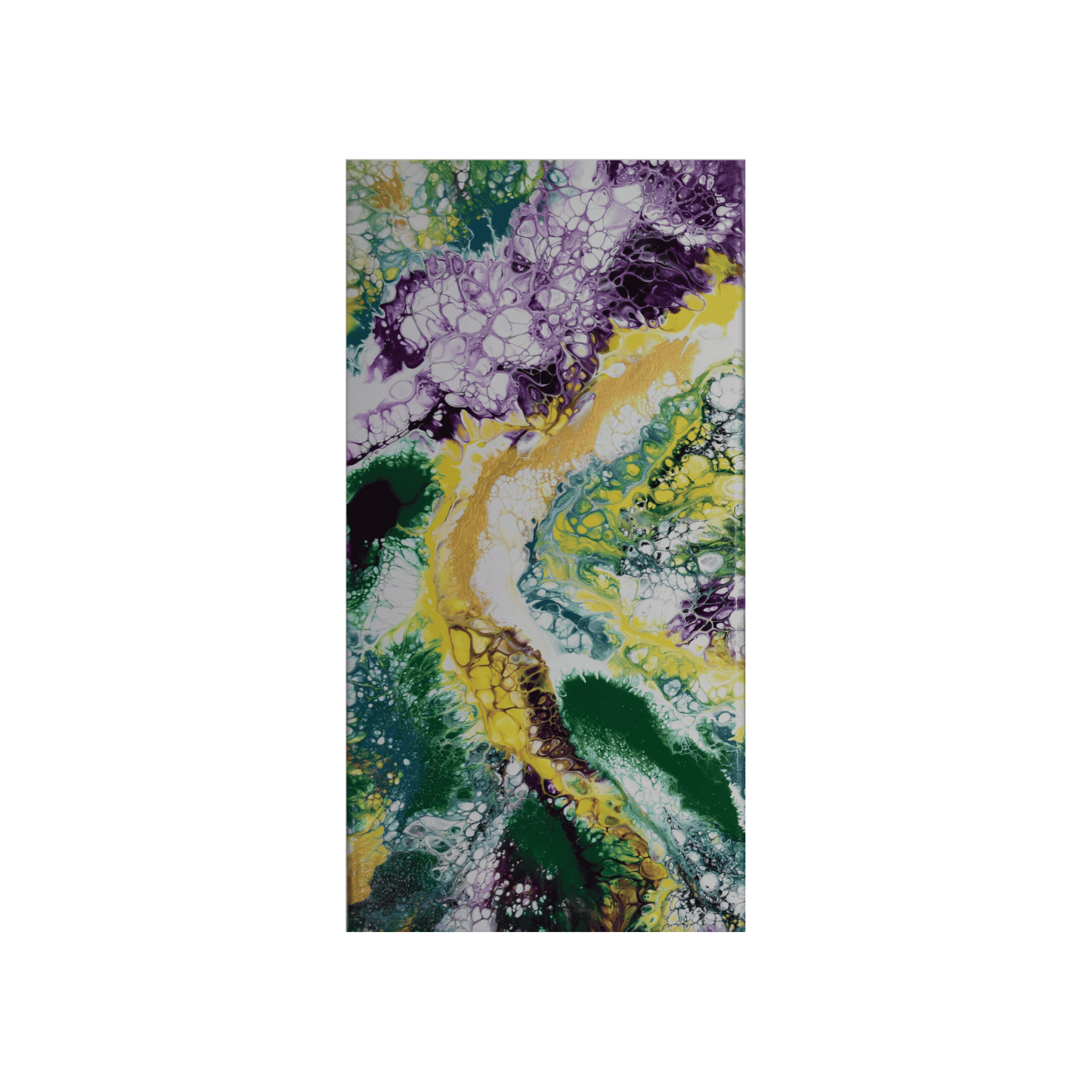
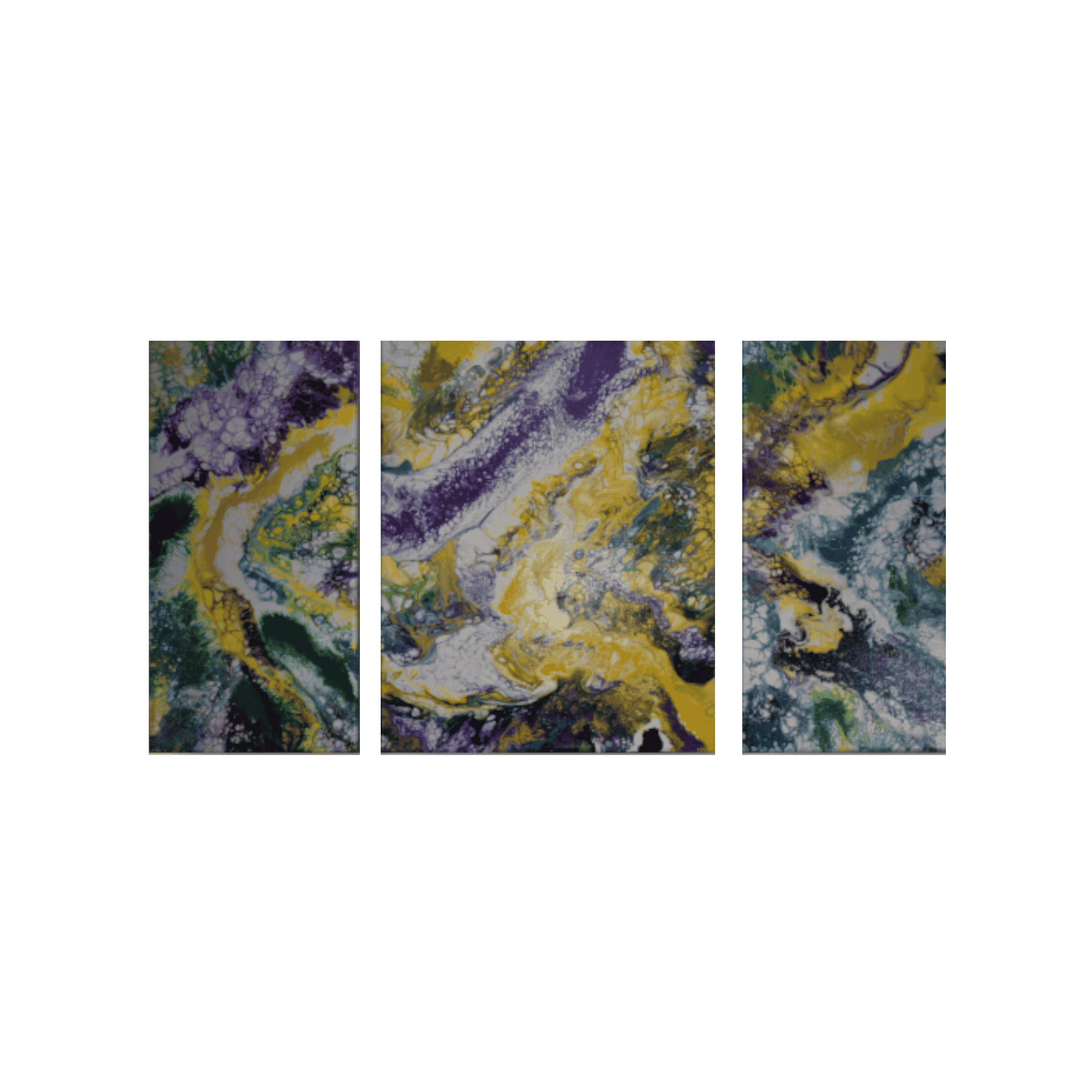
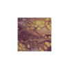
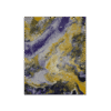
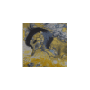
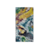
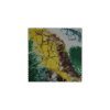
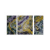
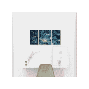
Title: Directed Backwards
Description: Directed Backwards is an energetic, original acrylic fluid abstract composition. No brushes, no boundaries—just paint, hairdryer, and intuition.
Hand-poured abstract artwork is one-of-a-kind.
Canvas treatment: Two applications of UV gloss clear coat.
Paint mixture: All the paints contain a mixture of pigment and paint conditioner.
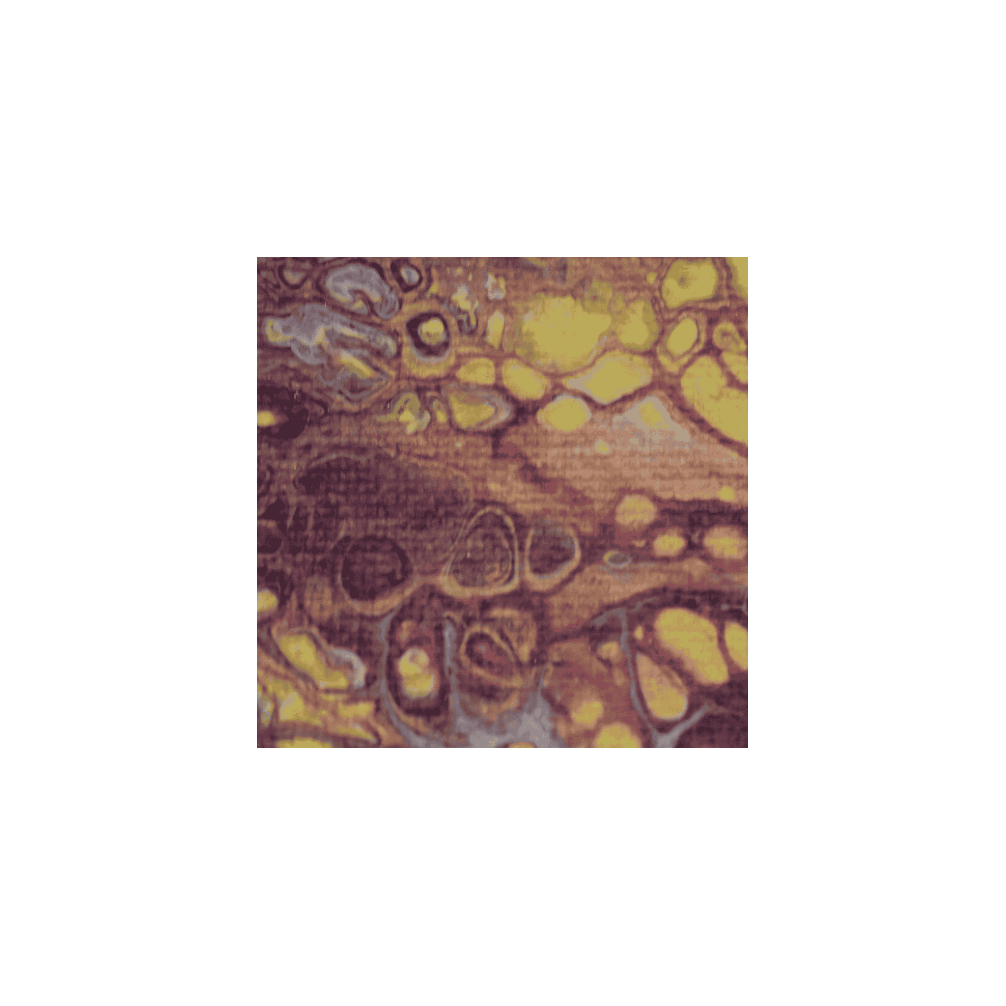
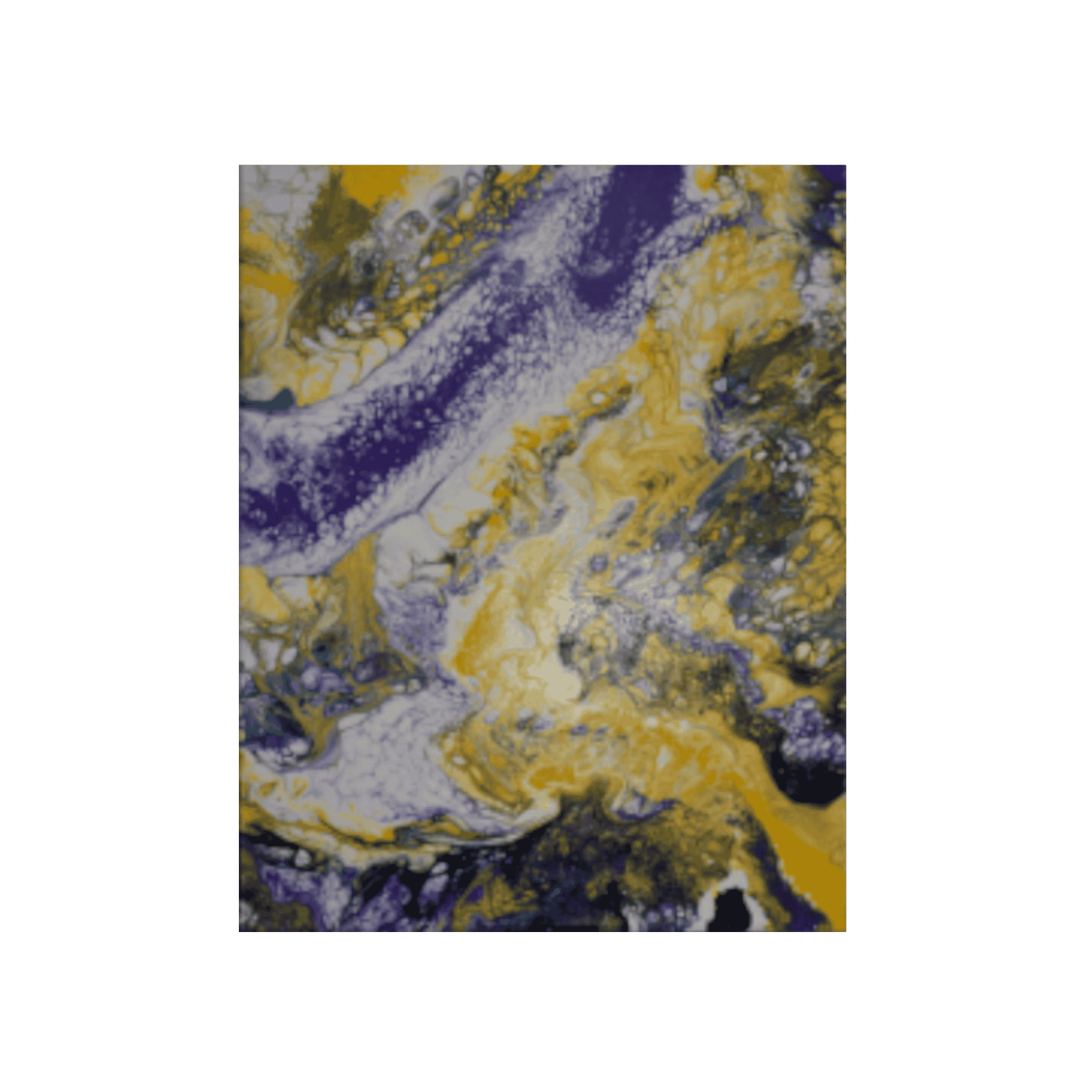
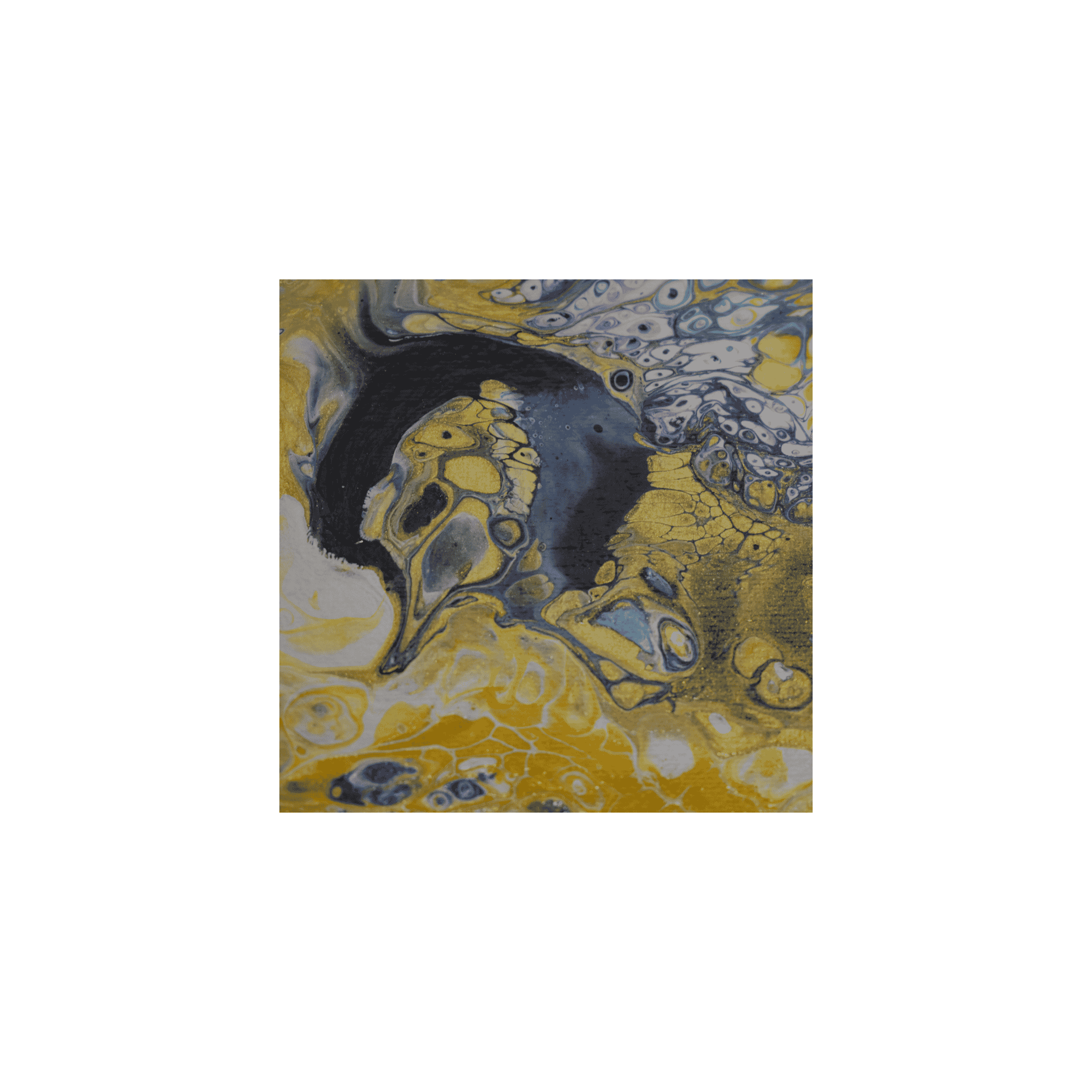
Color Palette
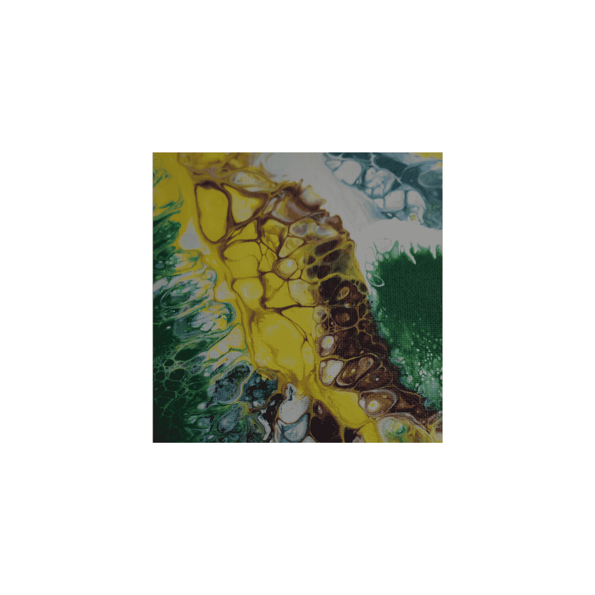
Dominate colors: Titanium White, Gold, Yellow, Purple, Indigo, Turquoise.
Contrast: High contrast of purple and yellow.
Harmonies: The color harmonies are complementary colors. These are opposite each other on the color wheel. Placing a warm color like yellow opposite a cool color like purple creates strong visual contrast
Emotion: Inspires energy.
Color blends: Purple and Yellow.
Technique: Dutch Pour. The paint was poured onto a base layer of white paint in a linear design, and then the design was further created using a hairdryer and tilting the canvases.
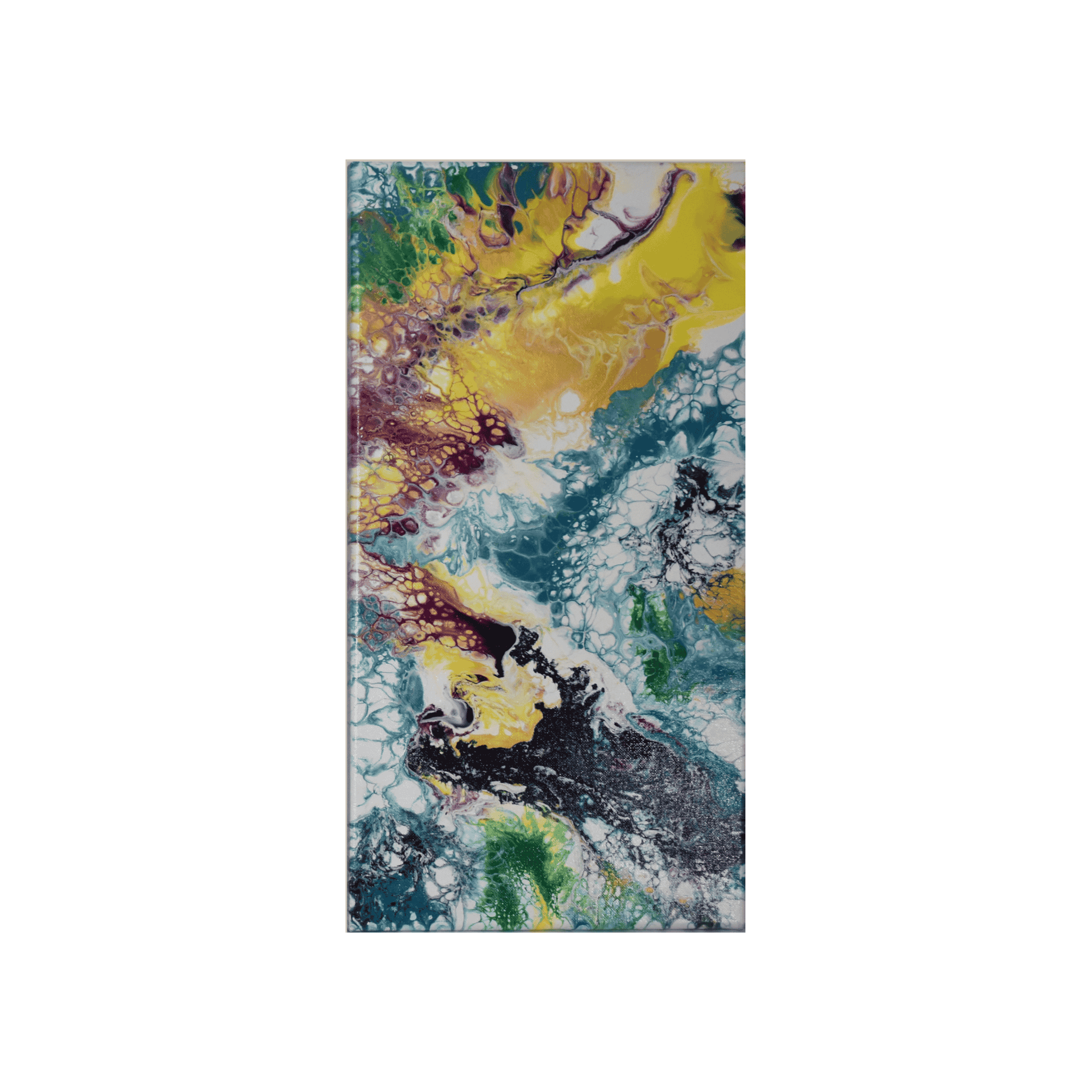
Formations and Shapes
Formations: By creating movement with air, lacing or delicate web-like patterns were formed across the canvases of Directed Backwards.
Shapes: Shapes of cellular patterns flow throughout this three-piece panel.
Texture and Surface Effects:
Surface Texture: Smooth.
Surface Effects: Glossy.
Acrylic painting pours rely on gravity and movement, allowing paint to swirl and blend organically. This lack of control can symbolize emotional release, letting go, or embracing chaos.
You may feel awe, peace, or introspection depending on the flow, contrast, and color palette because abstract forms invite your personal interpretation.
Each layer of paint can represent emotional depth, memory, or transformation. The final piece often feels like a visual diary of the artist’s inner state.


Reviews
There are no reviews yet.